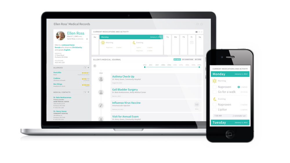
Three months ago we challenged graphic designers to help us reimagine what the patient health record could look like. We hoped that by making a patient health record more usable, the record could help prevent medical errors, empower patients to make better health decisions, and even save lives. We received a record number of submissions from graphic designers (more than 230). Our reviewers and curators were inspired by how the entrants were able to use design to make the record more human-centered and easy to use.
What’s special is that professionals (and students) inside and outside the health care industry participated in this graphic design contest to propose real solutions. Each one of them took the simple Blue Button text file and transformed it into something more useful for a patient, their family, and the people that care for them.

The Best Overall Design came from a group of graphic designers and strategists that work together at gravitytank in Chicago. Their entry, Nightingale , beautifully displayed a person’s medications and medical history that made it easier for a senior citizen to understand.
You can see the passion for the design challenge through the submissions. Studio TACK , MedPop , Blue Button Narrative , and M. Jackson Wilkinson all submitted detailed entries captured their thought process in redesigning the patient health record. The entries from Method , Josh Hemsley , and Andrew Conn explored how the health record adapts to different form factors, like print, computers, tablets, and smartphones. The teams behind hGraph and Health Summary weren’t afraid to think outside of the box. This challenge attracted graphic designers who can engineer too. Tony Webster and Vince Lane each built out their entries and submitted working prototypes.
We put together a showcase of the winning design entries for all communities to admire and learn from. The reviewers also selected a set of entries that challenged the status quo and have included those in the showcase.
The showcase can be viewed at: https://healthdesignchallenge.com .
Keep following this effort because it is not over. What’s happening next is exciting. The curators are going to select a final design (that may combine elements from various submissions) to be built and open-sourced on the code-sharing site GitHub . Our objective is to build the Bootstrap for the patient health record. With these tools, electronic health record software companies across the country will be able to integrate the final design into their products and contribute to the open-source project.
I’d like to thank our partners who have helped us throughout this: California HealthCare Foundation , Designer Fund , Health 2.0, Luxr , and Rock Health . Our reviewers and curators, thank you, this effort would not be possible without you.


